
Spending - Income Statistics on SmEx: Smart Expense Manager
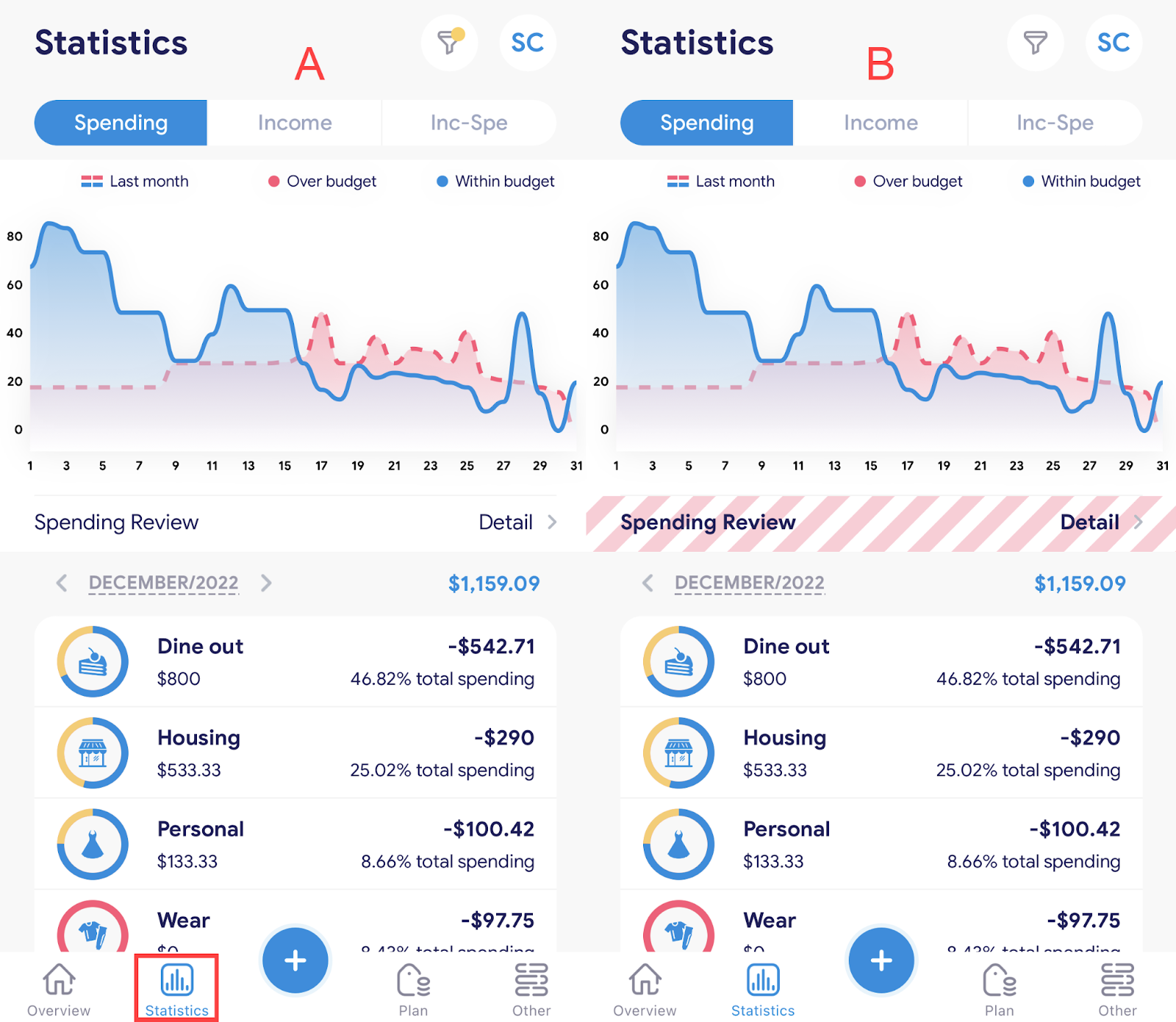
A. Open the “Statistics” screen
- There are 2 ways to open the “Statistics” screen:
Method 1: Select the item “Statistics” in the navigation bar. (Picture A)
Method 2: On the first login on the last day of the month, the system will automatically open the “Statistics” screen. (Picture B)
B. Detail chart “Statistics”
I. Statistics by month:
- Statistical chart of spending/income by month
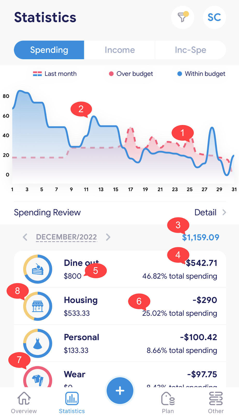
The statistics screen will provide you with the following information:
1. The dotted chart is the data for the previous month. (Blue is in the plan, red is out of the plan)
2. The solid line chart shows this month's data.
3. Total spending for this month. The green color represents the spending level within the plan, the red color shows the total spending that has exceeded the plan.
4. Total amount spent on a category.
5. The initial amount you plan to spend on this portfolio.
6. Indicates how much this category spends out of total money spent.
7. The red color of the circle indicates that the amount spent on this category has exceeded the original plan.
8. The yellow-green of the circle screen indicates that the amount spent on this portfolio is still within the allowable plan.
- Statistical chart of income and spending by month
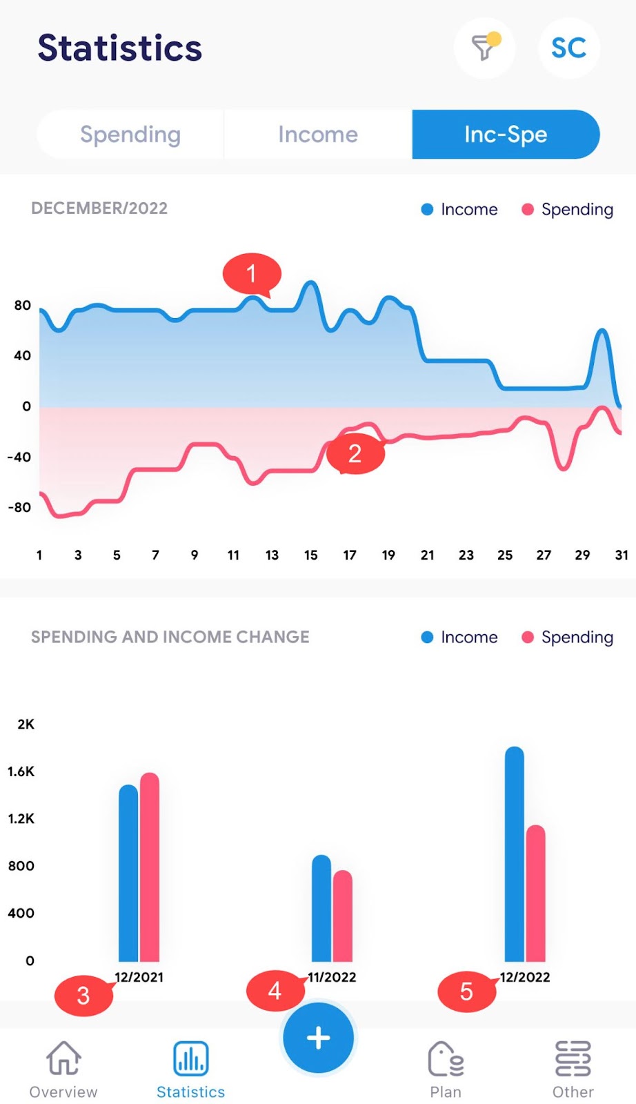
1. The blue line represents the monthly income with a positive value.
2. The red line represents the income for the month with a negative value.
3. Changes in income and spending for this month of the previous year.
4. Changes in income and spending of the previous month of this year.
5. Changes in income and spending for this month of this year.
II. Some other functions of the statistics screen:
- Filter function

Filter by month:
1. Click the filter icon (1).
2. Select the month you want to view.
3. Click “Done” (4) to finish.
Filter by year:
1. Click the filter icon (1).
2. Click on the currently selected month (2).
3. Select the year you want to view (3).
4. Click “Done” (4) to finish.
- Statistics function by day in a month.
There are 2 ways to view day statistics for a month:
Method 1: Click on any area of the graph on the statistics screen.
Method 2: Click on any area of the statistics section of the overview screen.
Then the statistics screen by day in a month will open:

1. Amount spent.
2. Amount leftover plan.
3. Blue indicates being in the plan.
4. Search for notes by notes, categories, and subcategories.
5. Total spending for the day.
6. Can swipe left to Duplicate - Hide - Delete notes.
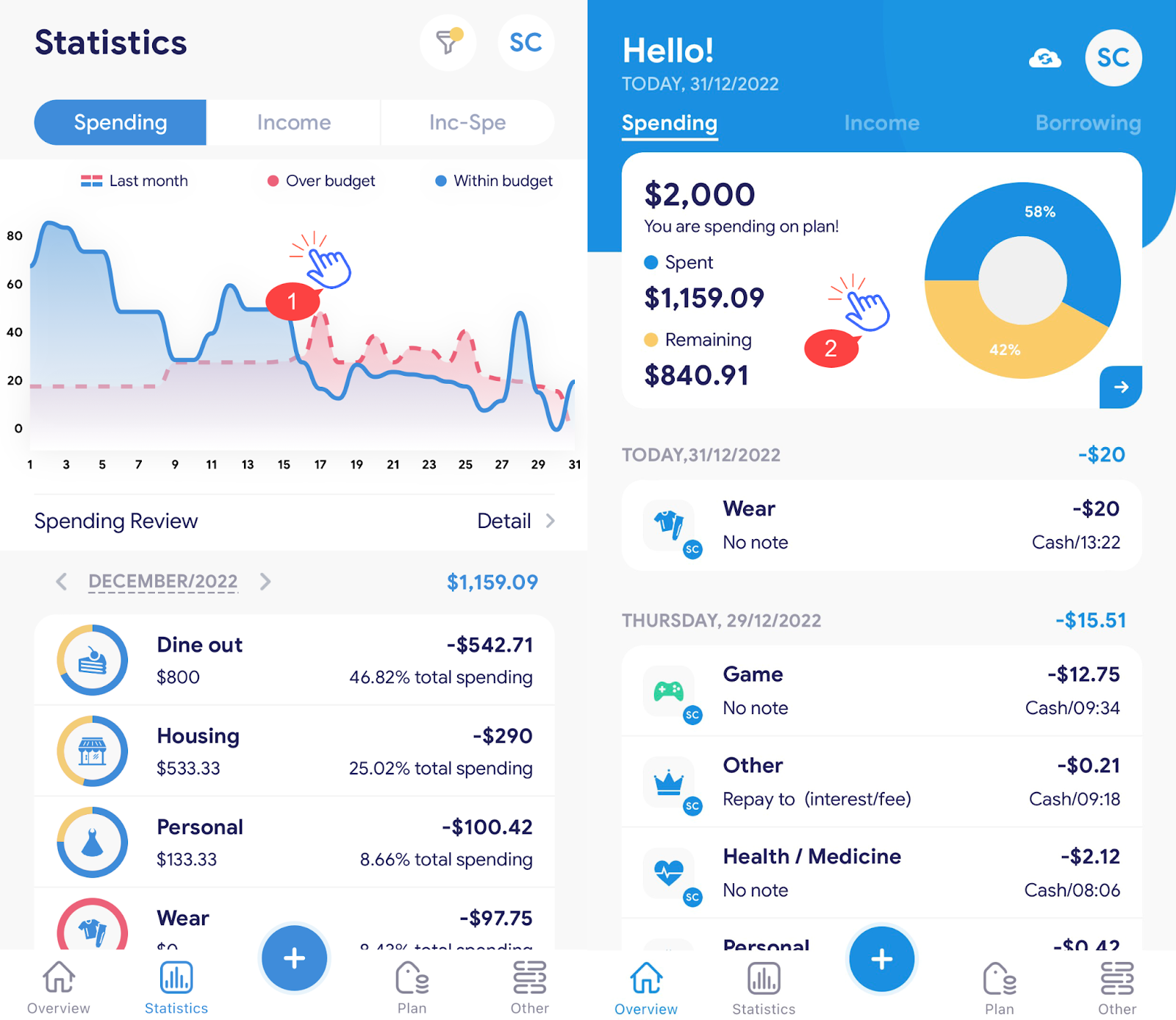
- See spending reviews
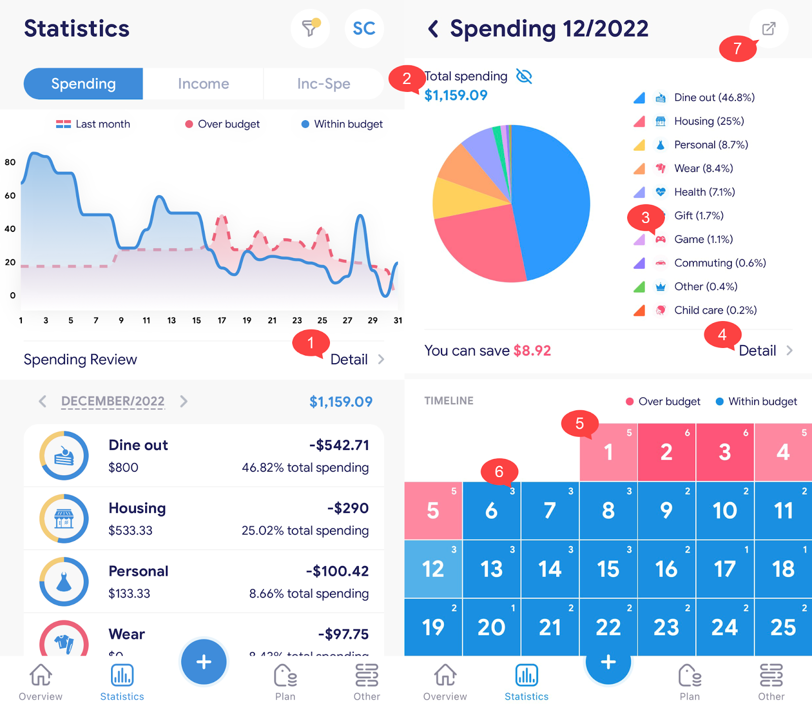
1. From the statistics screen, tap “Details” to see a spending assessment.
2. Total spending for the month.
3. Footnotes of each category. The red icon shows that the spending exceeds the plan, and the green color is within the plan.
4. Click “Details” to see the possible savings.
5. The number of records for the day. The red color represents the day's spending exceeding the plan, the green color is within the plan.
6. The number of records per day.
7. Click (7) to share a spending review.
III. Statistics by year:
- Statistical chart of Spend/Income by year
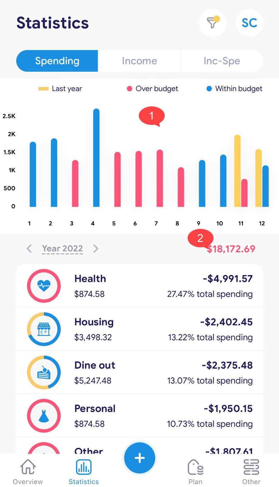
Using time filters for statistical graphs
1. The graph shows spending this year and the previous year. For this year, blue indicates the month in which the spending falls within the plan, and red indicates the overrun.
2. Total spending for the year.
- Statistical chart of income and spending by year
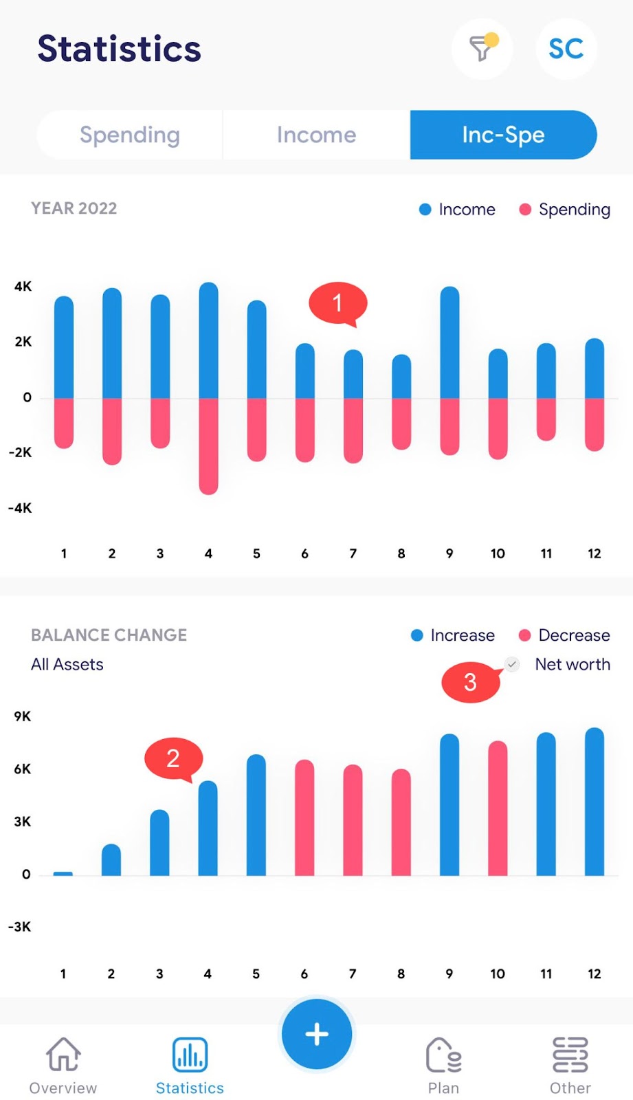
Use a time filter for statistical graphs.
1. The chart shows income and spending statistics for each month of the year with positive values being income, and negative values being expenditures.
2. Changes in account balances from month to month. The first-month defaults to blue, and the following months are displayed in red, higher than the previous ones are displayed in blue.
3. Net asset balance fluctuations will be displayed when clicking (3).